5 section design ideas to improve your page layouts
It's no secret that getting your page layout right is crucial for better page design. But it's important to remember that your page layout is usually made up of a few different sections, so designing and building better sections plays a big role in better page and site design.
One thing that will improve your ability to make better sections is knowing more ways you can lay out content, so here are 5 section design ideas that you can use on your own sites today.
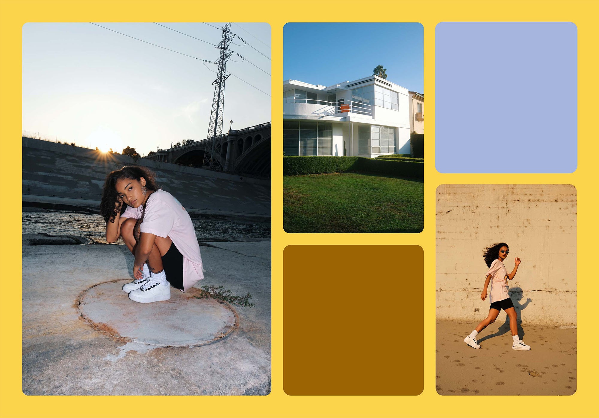
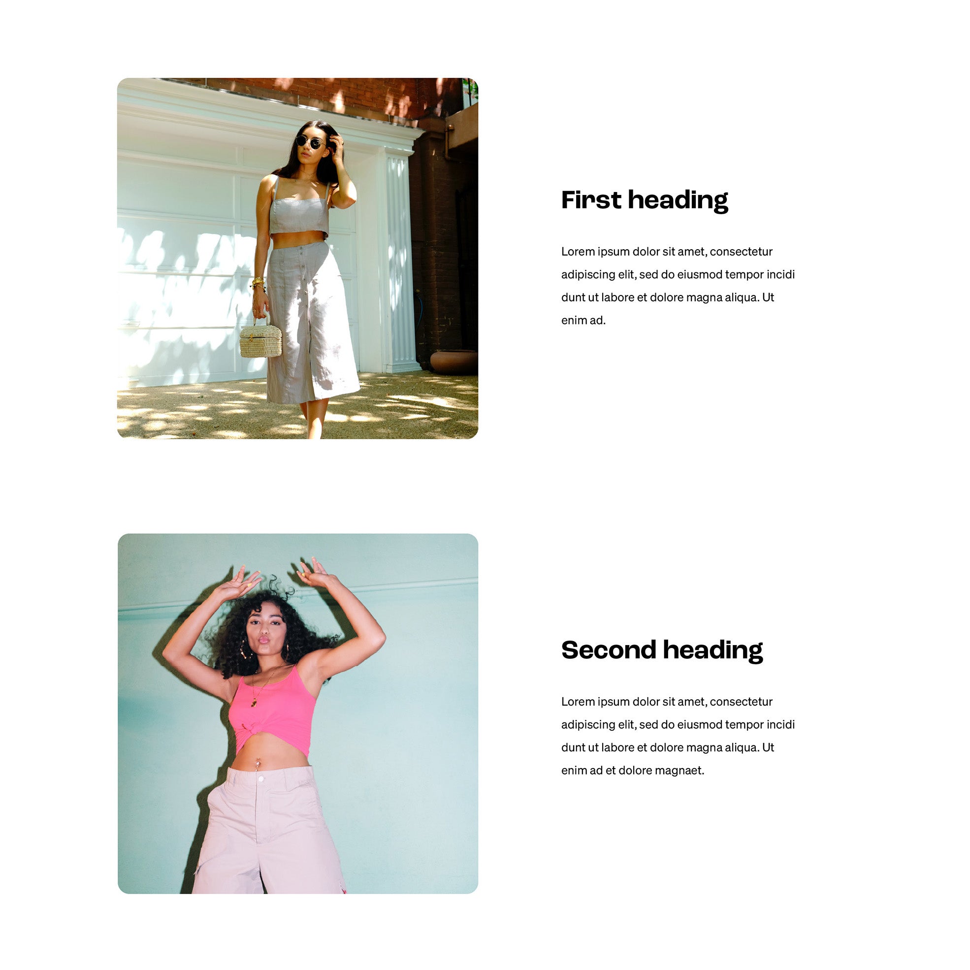
While an alternating grid can mean any two patterns of rows and columns that alternate, the design featured here is a row with one column followed by a row with two equally sized columns, which is great when using a wider and a taller image in the same section.
On desktop, try centering the text in the first row and aligning the text to the left in the second row. For mobile, try aligning all text to the left and be sure to use the same order for the image and text. Reference site to check out:
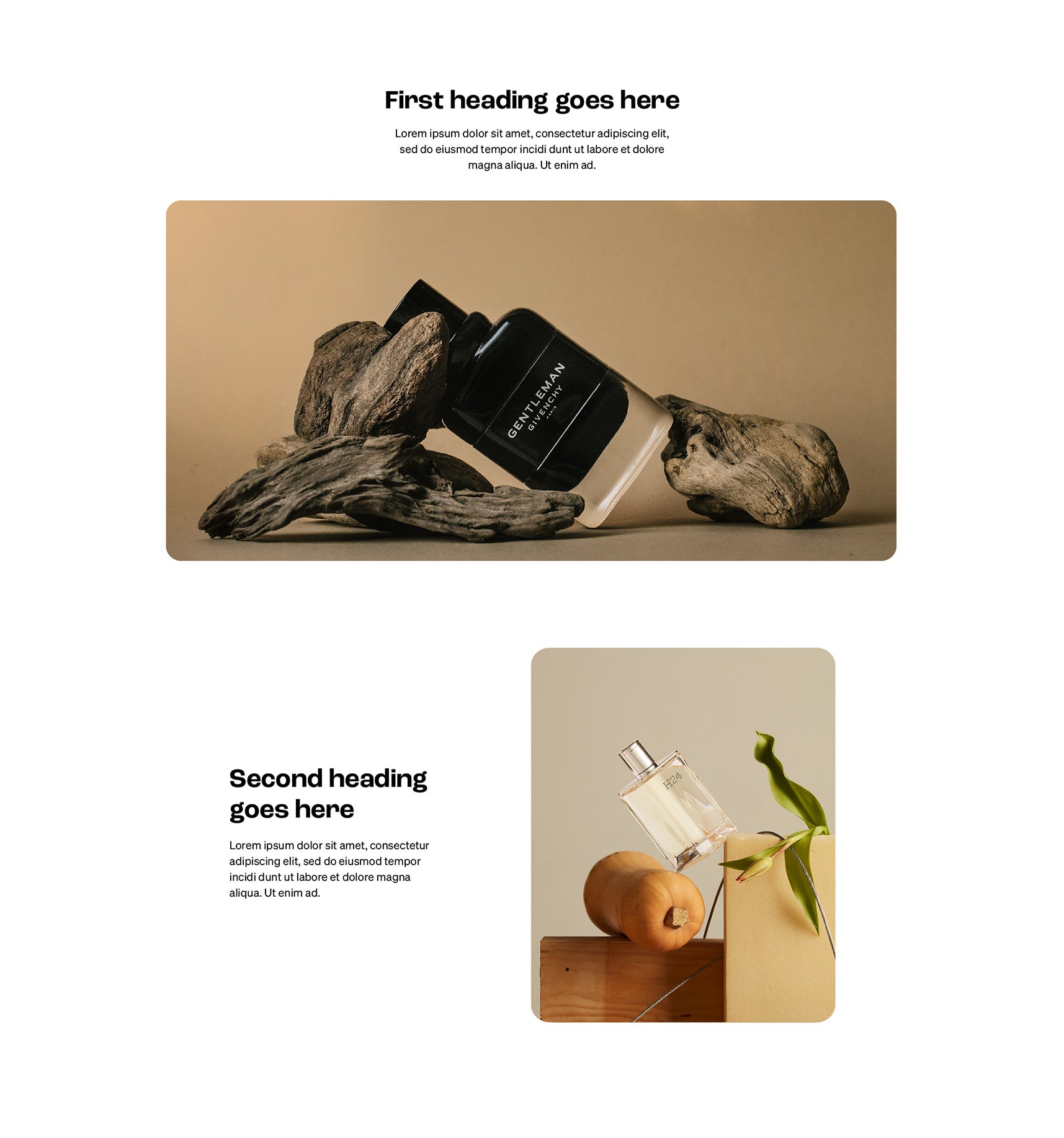
An offset is used to push columns over to the right in a grid, creating space/margin to the left. For a modern look to your section, try offsetting some text so half of the row is empty to the left.
I love using this layout when you want to emphasise some copy with a bit of style. Some reference sites to see the layout in action:
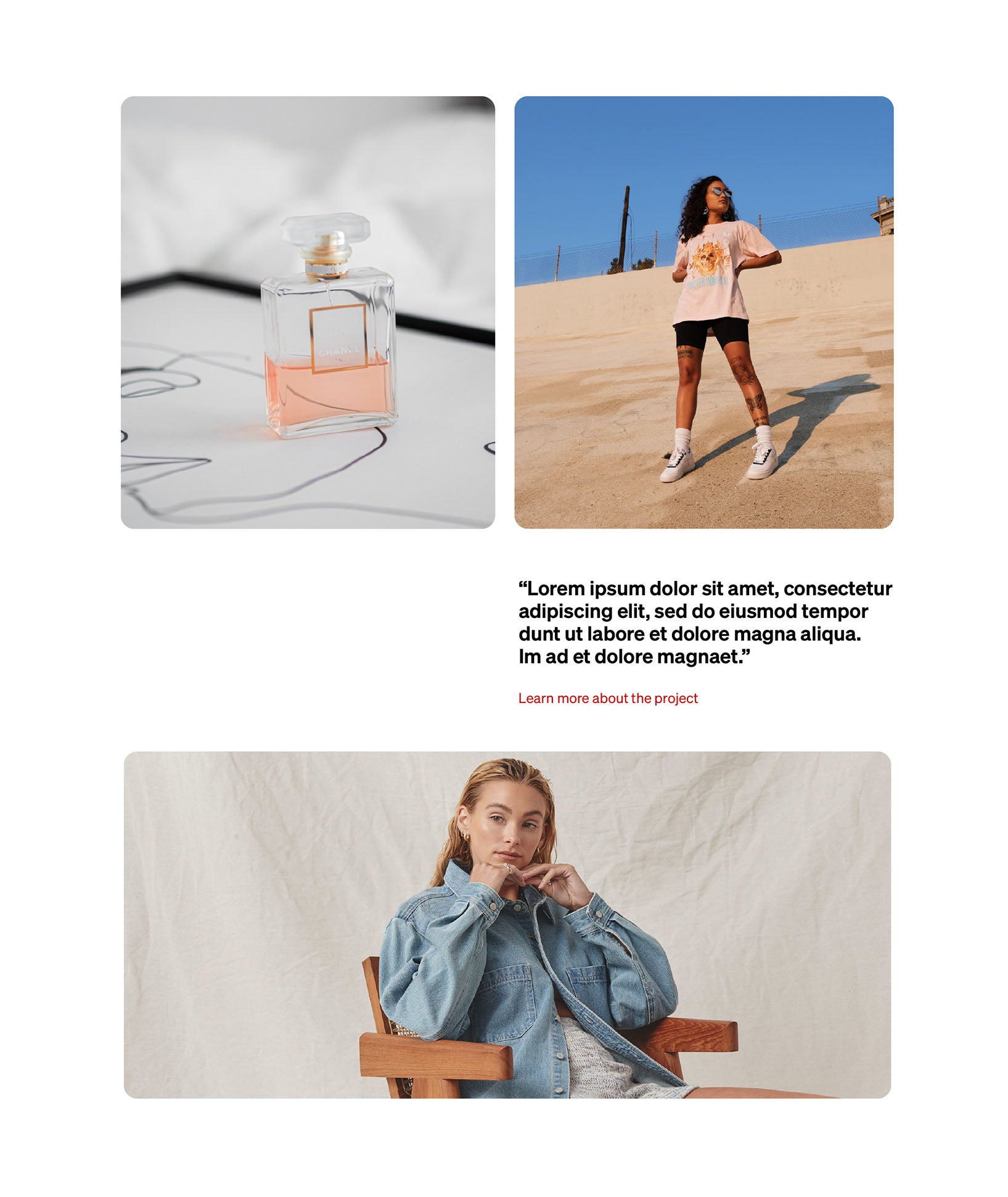
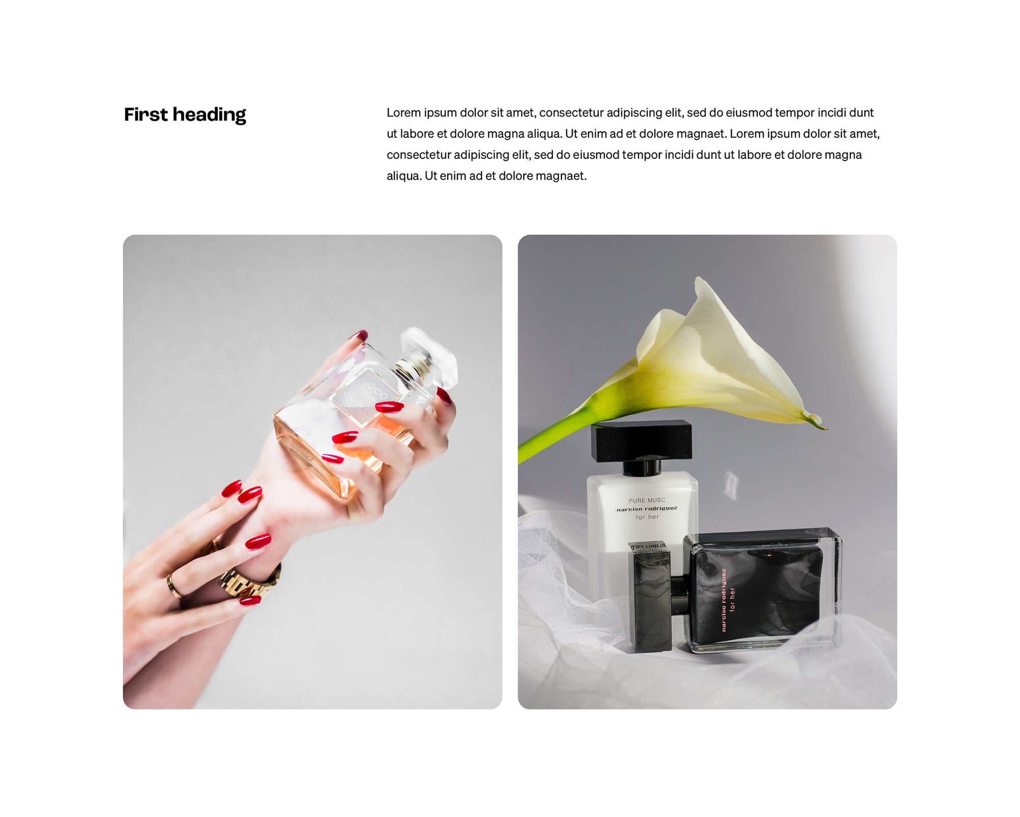
I'm a big fan of asymmetric grid layouts, they use space efficiently, look great and encourage better line lengths for your paragraphs – which on the web should be around 45-85 characters, including spacing and punctuation. To get started with this layout, try using a column with 33.3% width for headings and one with 66.6% width for paragraph text.
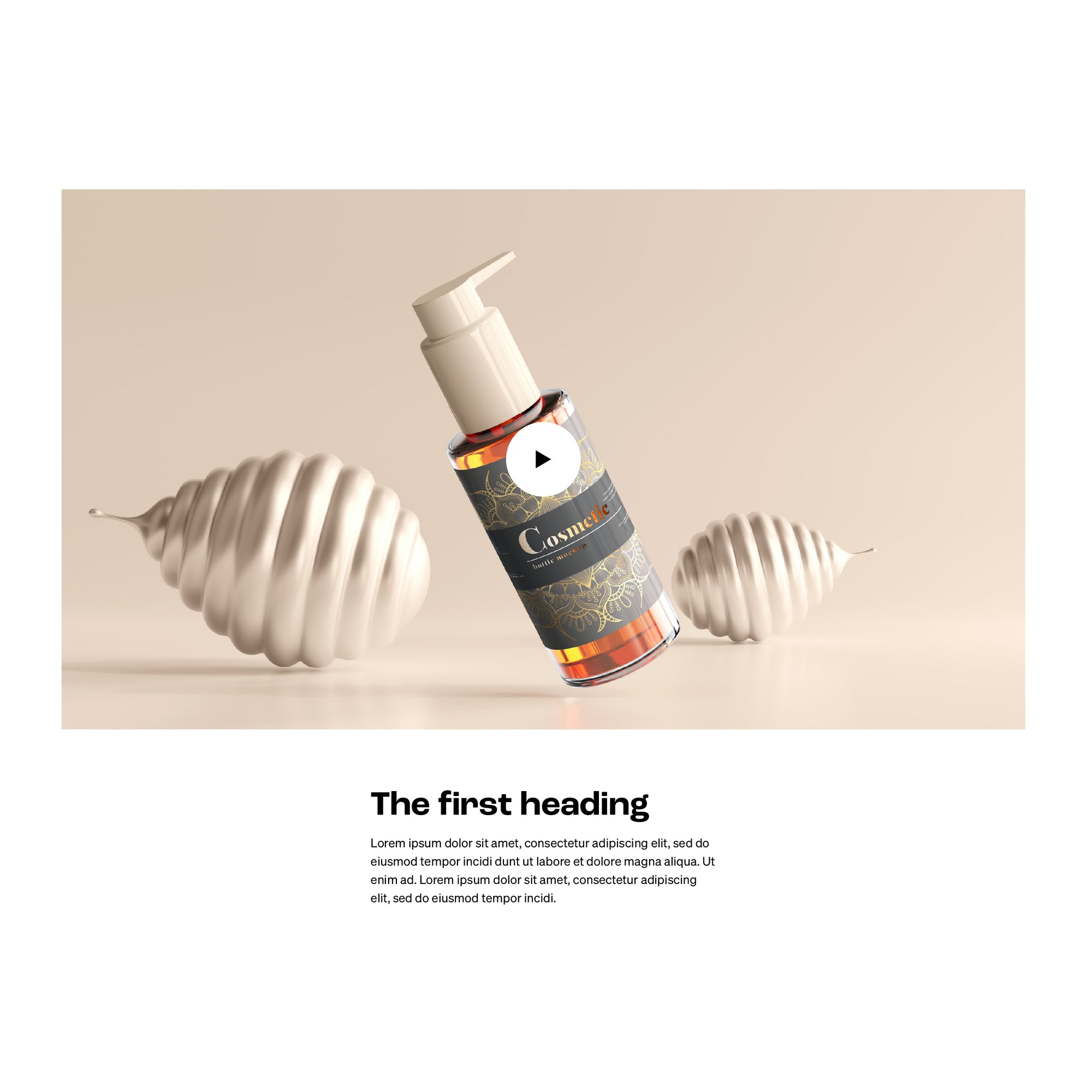
If you need to get video into a section, try the video at 80–100% width and the content below at 50% width, centered. For the text, try aligning to the left when below the video but center-align if placed above the video.
When making video sections, remember that a web page that suddenly starts making noise without warning can be jarring, inconvenient, or off-putting for your users. So only autoplay if the video is muted. A reference site to check out:
The F shape design is a classic, editorial layout that often gets overlooked in favour of the ubiquitous Z-Shape pattern. But it's making a comeback, so try leaving the Z-Shape in the toolbox and using the F-Shape on your next web project.
You can use the F-Shape on a page with standard scrolling but to take the section design to the next level, try building a section with sticky scrolling. Reference sites for each scrolling style:
Your cart is currently empty.